Mix Kitchen Patterns Like a Pro (No Visual Clutter)
Mixing Prints Without the Chaos: A Kitchen Pattern-Mixing Checklist
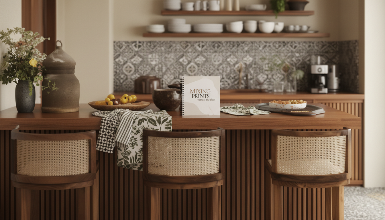
Pattern in a kitchen can feel instantly inviting—or instantly overwhelming. The difference usually comes down to a few steady choices: a consistent color plan, a clear “lead” print, and a repeatable way to scale and place patterns across towels, rugs, tile, curtains, and small decor. Use the checklist-style steps below to build a layered look that feels collected, not cluttered. For more guidance, see How to Choose a Colour Scheme for Your Kitchen – Naked Kitchens.
Start with a clear anchor: what stays, what changes
Before choosing a single new print, get specific about what’s already “locked in.” Kitchens have more fixed visual elements than most rooms, and those surfaces quietly dictate what patterns will feel natural. For further reading, see Top Trends for Kitchen Design Color Schemes.
- List the fixed elements: cabinets, countertops, flooring, and major appliances.
- Identify the dominant surface: often backsplash tile, floor, or countertop veining. Treat it as the anchor pattern/texture—even if it’s subtle.
- Choose 1–2 changeable zones to carry most of the pattern (commonly window treatment + rug, or rug + towels).
- Decide the mood in one line (for example, “warm vintage,” “crisp modern,” “coastal light”). Use it to filter everything that follows.
If you want a fast, print-friendly way to keep these decisions in one place while shopping, the Mixing Prints Without the Chaos – How to Mix Patterns in Kitchen Checklist can act as a simple plan page you refer back to when you’re tempted to add “just one more” bold item.
Pick a color plan that limits decision fatigue
Color is the glue that makes mixed patterns look intentional. A restrained palette also makes it easier to edit later if the room starts to feel loud.
- Choose 1 dominant color, 1 supporting color, and 1 neutral (plus metal/wood tones already present).
- Keep at least one pattern mostly neutral so the eye has a resting place.
- Repeat the dominant color at least three times (rug, towel, and a small art piece, for example) to create a through-line.
- If the kitchen is small, prioritize lighter backgrounds and use high-contrast patterns in smaller doses.
For a quick refresher on how core design elements (like color, texture, and contrast) work together, this overview from the National Park Service is a helpful reference: The Basic Elements of Design. Color choices also influence how a space feels day to day; for more on that, see Color Psychology.
Simple kitchen palette rules for mixing patterns
| Kitchen condition | Recommended palette move | Why it helps |
|---|---|---|
| Busy countertops or open shelving | Increase neutrals; use one accent color | Reduces visual competition with everyday items |
| All-white cabinets and plain backsplash | Add 1 medium-contrast pattern + 1 small-scale pattern | Creates depth without heaviness |
| Dark cabinets or low natural light | Use light-background prints; keep contrast moderate | Prevents the room from feeling closed-in |
| Strong existing material (marble, terrazzo, bold tile) | Match one color from the material; keep other prints quieter | Lets the fixed surface stay the hero |
Use the 1–2–3 pattern formula to keep it cohesive
When patterns multiply, the simplest way to avoid “visual noise” is to assign each print a job. Think in threes:
- Pattern 1 (hero): medium-to-large scale (a rug/runner, curtain, or statement roman shade).
- Pattern 2 (support): medium scale with a related color family (striped towel, café curtain, or seat cushion).
- Pattern 3 (accent): small scale or subtle texture (gingham, tiny floral, speckle, herringbone).
- If adding a fourth, make it a solid texture (ribbed, waffle weave, natural fiber) rather than another busy print.
This formula works because it builds hierarchy: one pattern leads, one echoes, one adds detail—then texture handles the “in-between” without demanding attention.
Scale, contrast, and spacing: the three checks that prevent chaos
If the kitchen feels off but you can’t tell why, it’s usually one of these three things.
- Scale: pair one larger-scale print with one smaller-scale print so patterns don’t “fight” at the same visual distance.
- Contrast: if two patterns share similar contrast (both high-contrast or both low-contrast), separate them with a solid or a quiet texture.
- Spacing: avoid placing two busy patterns directly adjacent on large surfaces; insert a calm zone (solid paint, plain mat, simple tile).
A fast reality check: step back to the doorway. If the first thought is “pattern everywhere,” remove one print and replace it with texture (woven, linen-like, or matte ceramic).
Where patterns work best in kitchens (and where they don’t)
A practical checklist for pattern mixing (print-friendly steps)
Common pattern-mixing mistakes (and fast fixes)
Use a ready-made planner to speed up decisions
- Mixing Prints Without the Chaos – How to Mix Patterns in Kitchen Checklist (digital download) is designed for quick refreshes like towels + runner + small decor swaps.
- If you like structured worksheets for other projects too, Boost Your AI Prompts for Better Output – Checklist for Creators, Coaches & Entrepreneurs offers a similar “checklist-first” format for keeping plans organized.
FAQ
How many patterns can a kitchen handle without looking busy?
Most kitchens look balanced with 2–3 patterns plus solids and textures. Scale and contrast matter more than the count—small kitchens usually need fewer high-contrast prints and more light, quiet backgrounds.
What patterns mix well together in a kitchen?
Reliable pairings include stripe + floral, geometric + organic shapes, or check + toile when the palette is restrained. The key is sharing at least one color across the prints and varying the scale so one doesn’t visually compete with the other.
How do you mix patterns if the backsplash is already bold?
Treat the backsplash as the hero and keep textiles quieter—think simpler stripes, small-scale checks, or mostly-neutral prints. Pull one color from the tile into towels or a runner, and use solids/textures to create visual breaks.


Leave a comment