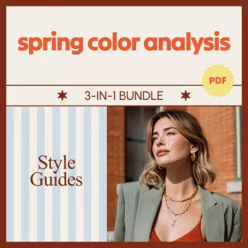
Spring Color Analysis Bundle: Light, True & Bright Spring
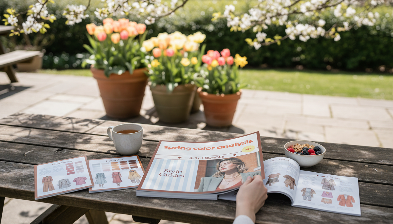
A Spring palette is defined by warmth, clarity, and a fresh, lively feel. The Spring Color Analysis Bundle brings three Spring-focused style guides together so colors can be chosen with more confidence across clothing, accessories, makeup, and overall styling—without second-guessing whether a shade looks dull, heavy, or overly cool.
What “Spring” means in seasonal color analysis
In seasonal color analysis, “Spring” is associated with a warm undertone, clearer/brighter chroma, and (for many people) a lighter overall sense of contrast than Autumn or Winter palettes. Spring colors tend to look clean, energized, and “sunlit” rather than smoky or shadowed.
- Core traits: warm undertone, brighter/clearer chroma, and generally lighter visual contrast than Autumn or Winter palettes.
- Why it works: warm, clean colors can make Spring features look more harmonious and awake instead of gray or tired.
- Common signs a color is “off”: cool blue-based pinks, dusty/muted shades, and very deep or smoky tones that overpower the face.
If you’d like a quick refresher on the building blocks behind undertone and color perception, sources like Britannica’s overview of color theory and Color Matters’ color basics are helpful references.
What’s included in the Spring Color Analysis Bundle (3-in-1)
The bundle combines three coordinated guides designed around Spring sub-seasons: Light Spring, True (Warm) Spring, and Bright Spring. Instead of trying to memorize rules or guess from swatches online, you get a consistent framework for choosing colors across clothing, accessories, makeup, and contrast.
- Three Spring sub-season guides: Light Spring, True (Warm) Spring, and Bright Spring.
- Built for real-life styling: wardrobe planning, makeup shade selection, jewelry metals, and outfit contrast.
- Reduces overwhelm: helps keep decisions consistent across tops, bottoms, shoes, bags, and beauty—so outfits feel intentional.
| Spring type | Overall vibe | Best neutrals | Great accents | Often best to skip |
|---|---|---|---|---|
| Light Spring | Warm + airy + delicate | light warm beige, cream, light camel | peach, apricot, light coral, aqua | very dark shades, icy pastels, heavy charcoal |
| True (Warm) Spring | Warm + sunny + clear | warm ivory, camel, warm tan | tomato red, warm turquoise, sunny yellow, leaf green | cool mauves, smoky grays, blue-based reds |
| Bright Spring | Warm + vivid + high-energy | warm off-white, warm navy alternative, toffee | bright coral, clear teal, lime, poppy | dusty tones, muddy browns, overly muted colors |
Explore the full set here: Spring Color Analysis Bundle | Spring Seasonal Color Analysis 3-in-1 Style Guides.
How to use the guides in everyday styling
The easiest way to make Spring colors feel effortless is to reduce the number of decisions you make each morning. A small, repeatable “color formula” keeps your outfits cohesive while still letting you have fun with accents.
- Start with a base: choose 1–2 Spring-friendly neutrals for the week (for example, cream + warm tan) and repeat them across outfits.
- Add 1–2 accent colors near the face: tops, scarves, earrings, glasses frames, or makeup (blush/lip) carry the biggest impact.
- Match contrast to your Spring type: Light Spring often shines with low contrast; Bright Spring can handle bolder contrast; True Spring typically sits comfortably in the middle.
- When undecided between two shades: choose the warmer and clearer option rather than the cooler or dustier one.
Building a Spring-friendly wardrobe palette
A Spring wardrobe doesn’t have to be loud or overly colorful. The goal is “warm + clean,” which can look polished, minimal, or bold depending on your sub-season and personal style.
- Neutrals that commonly flatter Spring: cream/ivory, warm beige, camel, light warm brown, and warm gray alternatives (avoid overly cool slate tones).
- Denim direction: light to mid washes and warmer blues often feel more aligned than very inky, cool-toned denim.
- Patterns and prints: look for clear, warm color combinations and crisp pattern edges; muddy or smoky prints can dull the overall look.
- Seasonless wear: keep Spring colors year-round by adjusting fabric weight—linen/cotton in warm months, knits/wool blends in cool months.
Makeup and hair color directions that pair well with Spring palettes
When makeup and hair echo the same warmth and clarity as your clothing, the effect is cohesive—features look brighter and more balanced, even with minimal product.
Accessories: metals, leathers, and finishing touches
A simple color-check method for shopping and closet edits
Who benefits most from a 3-in-1 Spring bundle
Shop related digital guides
- Spring Color Analysis Bundle | Spring Seasonal Color Analysis 3-in-1 Style Guides
- Returning to Work After Motherhood: Your Ultimate Guide for Stay-at-Home Moms (helpful for planning a polished, work-ready wardrobe refresh)
- Boost Your AI Prompts for Better Output – Checklist for Creators, Coaches & Entrepreneurs | Easy Prompt Upgrades for Better Output | Digital Download (useful for organizing wardrobe plans, packing lists, or capsule outfit ideas)
FAQ
What’s the difference between Light Spring, True Spring, and Bright Spring?
Light Spring is warmer with a lighter, airy value and softer contrast; True Spring is the warmest and most “sunny-clear”; Bright Spring keeps warmth but turns up chroma and contrast. For example, coral becomes a lighter peach-coral in Light Spring, a warm sunny coral in True Spring, and a sharper, more vivid coral in Bright Spring.
Can Spring palettes wear black or bright white?
Many Springs look more harmonious in cream, warm off-white, camel, or warm navy alternatives, especially near the face. Black or bright white can still work in small doses, in prints, or worn away from the face—how well they work often depends on your sub-season and the overall outfit contrast.
How can a Spring palette work in fall and winter outfits?
Keep the same warm-clear color direction while switching to heavier fabrics and layered textures. Lean on camel and deeper warm browns, warm teal, warm reds, and gold-toned accessories to make the palette feel seasonal without going muted or smoky.


Leave a comment