AI Home Styling: Personalized Modern Design Workflow
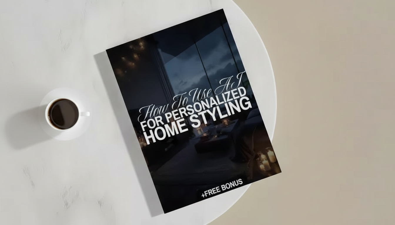
How to Use AI for Personalized Home Styling: A Digital Guide to Modern Design
AI tools can turn a vague “make it feel more modern” goal into clear, room-by-room direction—style options, color palettes, layout ideas, and shoppable look-alikes—while keeping decisions grounded in the real constraints of a space. The best results come from treating AI like a fast design assistant: you provide accurate inputs and guardrails, then you curate and execute. Below is a practical workflow to define a style, plan a cohesive look, avoid common mistakes, and finish a room with simple styling moves that look intentional.
Start with a clear design brief (so the results look like your home, not a showroom)
A modern space feels “easy” because the decisions behind it are consistent. Before generating ideas, write a short brief that locks in what’s real about your home and what success looks like.
- Capture constraints first: room dimensions, ceiling height, window placement, and anything that must stay (sofa, dining table, flooring).
- Define the feeling in plain language: calm, bright, cozy, gallery-like, warm minimal, playful modern.
- List 3–5 non-negotiables: “easy-clean fabrics,” “no white rugs,” “must include closed storage,” “kid-friendly corners.”
- Collect a small reference set: 8–12 images maximum to avoid style drift; include at least 2 images of your actual room.
- Choose a budget band and timeline: one weekend refresh vs. staged upgrade over 3 months.
If you want a structured way to turn these notes into a repeatable plan, How to Use AI for Personalized Home Styling | Digital Guide for Modern Home Design, AI-Powered Interior Inspiration & Easy Styling Tips is a quick digital reference you can keep open while you plan, shop, and style.
Feed AI the right inputs: photos, measurements, and style signals
Most “AI design fails” happen when the tool has to guess scale, lighting, or what you’re keeping. Give it fewer mysteries and you’ll get fewer unusable ideas.
- Use well-lit, wide-angle room photos; include each wall and a corner shot to show depth.
- Add measurement notes directly in a simple text list (wall lengths, rug size target, clearance needs around doors).
- Provide a “keep/replace” inventory to prevent AI from redesigning around items that are leaving.
- Share a color direction: existing fixed finishes (wood tone, countertop, tile) plus 2–3 preferred accent colors.
- Ask for multiple variations of the same room concept (3–5 options) to compare rather than latch onto the first output.
Inputs that improve AI home styling results
| Input | Why it matters | Quick example |
|---|---|---|
| Room photos (all walls) | Reduces layout errors and mismatched lighting | 4 photos + 1 corner shot |
| Measurements | Prevents unrealistic furniture scale | Sofa wall 110 in; rug 8×10 |
| Fixed finishes | Keeps palettes compatible | Warm oak floor; black hardware |
| Lifestyle notes | Makes choices practical | Pet hair; toddler-safe; needs storage |
| Budget range | Keeps suggestions realistic | $300 refresh or $2,000 upgrade |
For faster, cleaner outputs, keep a reusable input checklist handy. Boost Your AI Prompts for Better Output – Checklist for Creators, Coaches & Entrepreneurs | Easy Prompt Upgrades for Better Output | Digital Download works well as a quick “did I include measurements, must-keeps, and budget?” double-check before you generate variations.
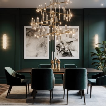
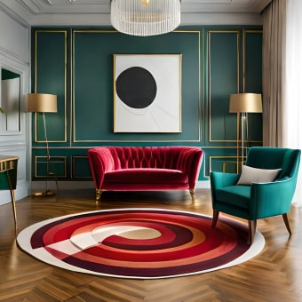
Turn AI inspiration into a cohesive modern look (without overhauling everything)
Modern design looks polished when it’s edited. The goal isn’t to replace every piece—it’s to make choices that repeat and relate.
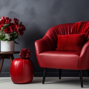
- Pick one primary style lane and two supporting descriptors (example: “modern + warm minimal + organic textures”).
- Limit the palette to a simple structure: 60% base neutral, 30% secondary tone, 10% accent color/metal.
- Repeat finishes across the room: 1 main wood tone, 1 metal finish, and 1 textile family (bouclé, linen, wool).
- Generate a mini “style rule set” (do’s and don’ts) so every purchase fits the same logic.
- Create a short “yes list” of cues (arched floor lamp, low-profile silhouettes, ribbed glass) to guide selection.
A helpful lens is basic visual hierarchy—what reads first, second, and third at a glance. Principles like contrast and balance are what make “simple” look intentional, not bare (see Nielsen Norman Group’s visual design basics for a clear overview that translates surprisingly well to interiors).
Room-by-room workflow: layout, focal point, lighting, then layers
When styling feels overwhelming, it’s usually because too many decisions are happening at once. Use a sequence that builds structure first, then adds softness and personality.
1) Layout
2) Focal point
3) Lighting
4) Textiles
5) Styling layers
Add art, greenery, and objects last; keep surfaces at roughly 30–40% “empty space” to maintain modern clarity. If you need inspiration that still feels livable, browsing real-home projects on Houzz can help you sanity-check scale and practicality.
Easy styling tips that make AI-led designs look finished
Common pitfalls and quick fixes
Make it actionable: a simple checklist for your next styling session
FAQ
What information should be shared with AI to get accurate room ideas?
Share wide-angle photos of all walls, basic measurements, what must stay, lifestyle needs (kids/pets), fixed finishes (flooring, counters, hardware), and a budget range. These details prevent scale mistakes, keep color choices compatible with what you can’t change, and steer suggestions toward realistic materials and pricing.
Can AI help match new decor to existing furniture and finishes?
Yes—start by naming fixed finishes (wood tone, metal color, countertop/tile undertones), then ask for a limited palette and compatible materials. To avoid finish overload, stick to one dominant wood family and one metal finish and repeat them across lighting, hardware, and small accents.
How can a room look modern without feeling cold or empty?
Use warm neutrals, layered lighting, and a texture-first approach (linen curtains, a bouclé chair, warm wood). Keep decor fewer but larger, and protect intentional negative space so the room feels calm rather than sparse.


Leave a comment